Digital Waybill is a courier software that enables customers, dispatchers,and drivers communicate up to the minute of when a package is to be delivered. They needed a brand refresh that included a new look and feel to their UI of their mobile and desktop apps, a new website, and new packaging for onboarding clients.
I worked as the UX/UI designer and came up with the look & feel as well as how the client interacts with the product. This included layout, typography, color & design direction. It also consisted of an updated charting mechanism and modernizing the data visualization of the product.
- Research & Discovery
- Wireframing
- Ideation
- UX Design
- UI Design
- Prototyping
- Client Testing
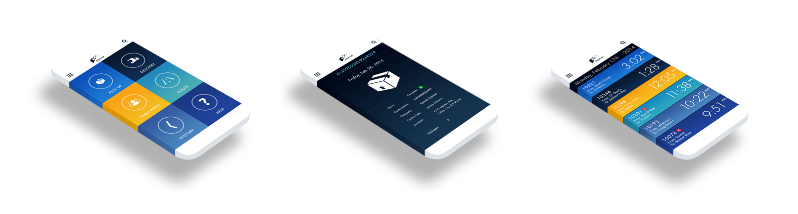
Making it Mobile
All in the palm of your hand
One of the most necessary tools for DW is their mobile app. We needed something that was easy to use that allowed folks on the delivery end to update their tracking info as well as signature and proof of delivery features. Clients needed to be able to scroll through sometimes thousands of deliveries and be able to locate them quickly.
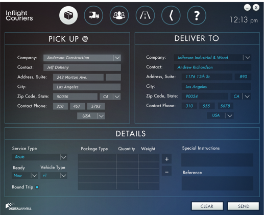
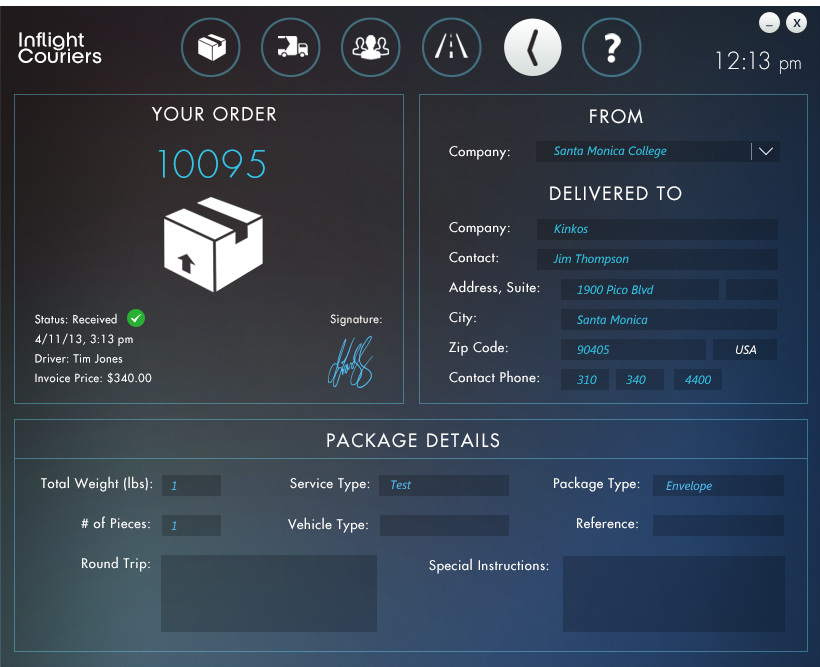
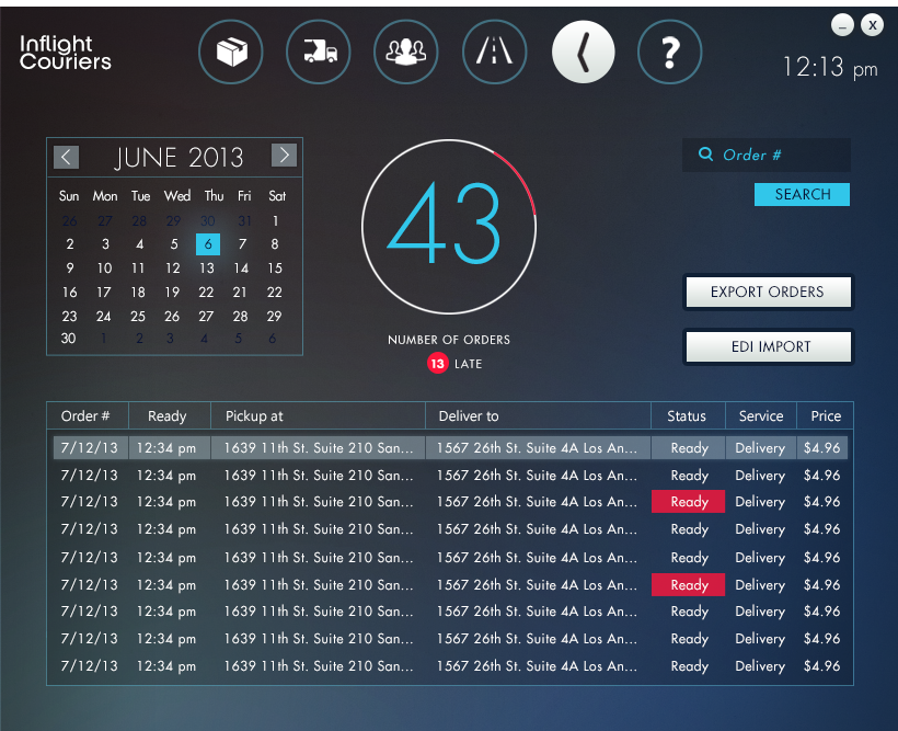
A Design for Desktop
A redesigned order panel
DW also needed a new look and feel to their desktop apps. When I was hired, the desktop platform was definitely old school and could use a modern upgrade. We gave it a dark background with the dark blue color that was it's base color.
Webkit
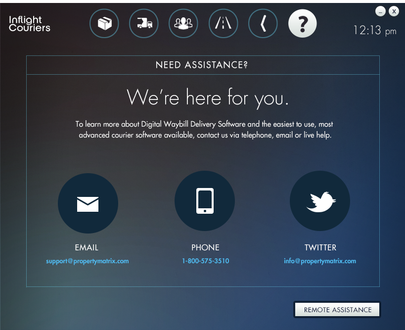
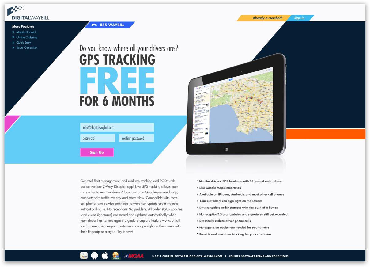
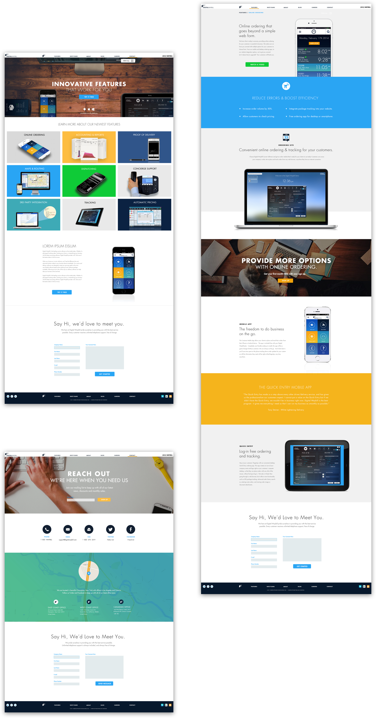
The digital store front
Digital Waybill needed a website that clearly communicated what their software was able to achieve and how it could benefit their customers. They needed a modern look and feel that sold its potential customers on its trustworthyness and its state of the art technology.
All Purpose Packaging
All parts included
We also needed to create some packaging that would be mailed out to prospective clients enticing them to try our platform. I had to design the box, disc, disc packaging and instructions. The project was a success. We saw an increase in trial offers, general inquires and subscriptions after mailing.

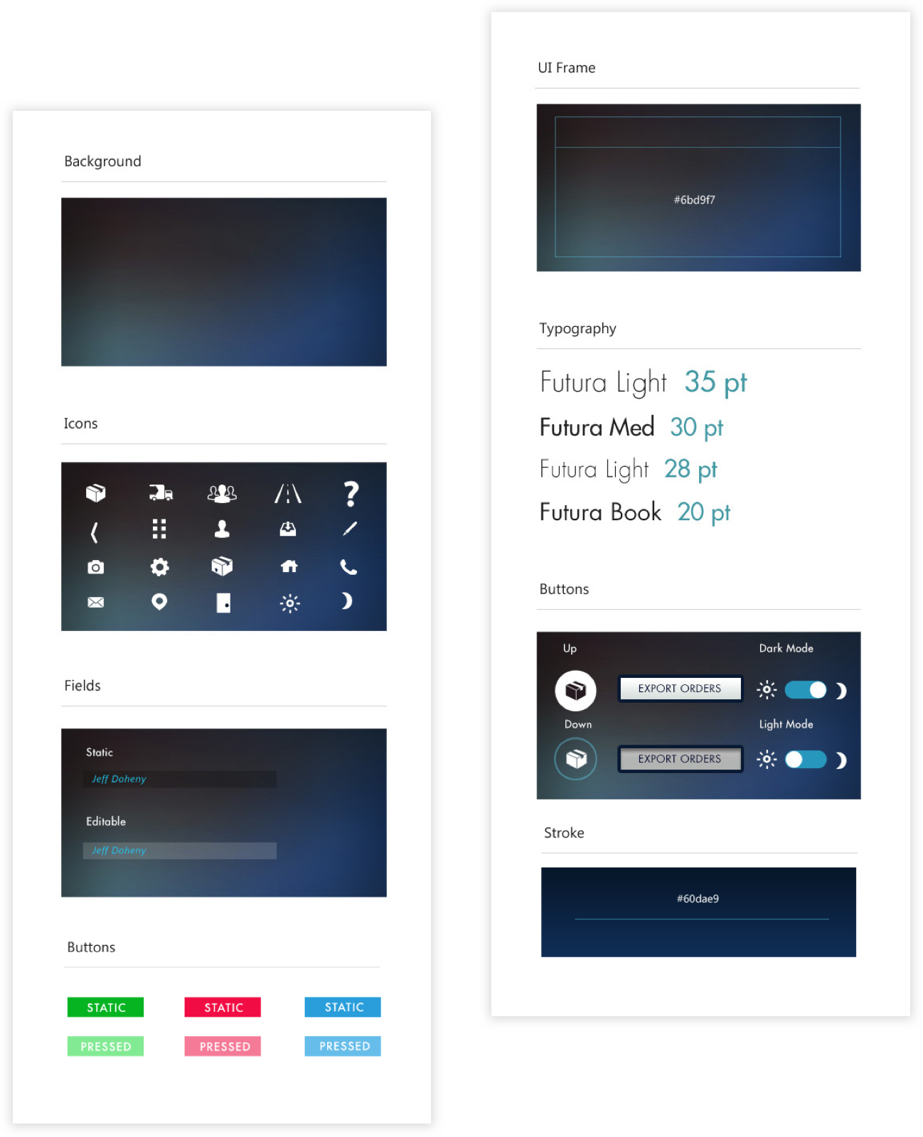
Style Guide
The digital store front
The DW style guide was created to help guide developers and designers with instructions on how to treat buttons, icons, and backgrounds.